

FabricGraph: Visual Ontology Builder
DevTools UX/UI, Data Modeling Interface
FabricGraph lets teams model and manage complex data through a clean, visual interface. With team editing, hierarchy navigation, and relationship control, it simplifies structured data work for engineers and architects.
Problem
Large-scale technical systems (in infrastructure, engineering, or semantic data) rely on complex class hierarchies and data models. Managing these models is often fragmented, confusing, and time-consuming. FabricGraph solves this with a clean, visual interface that lets users create, edit, and structure data relationships with full control and semantic precision.
UX Thinking
User Personas
Data architects and system engineers modeling structured information
Infrastructure teams managing standard object classes and attributes
Goals
Make deep data models easy to navigate and modify
Offer a logic-first UI with visual clarity, not visual noise
Provide users with confidence in rule-setting and relationship handling
Key UX Strategies
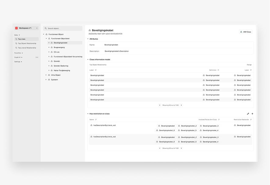
Tree-based navigation to explore class hierarchies efficiently
Clean editing panes for managing properties, relationships, and restrictions
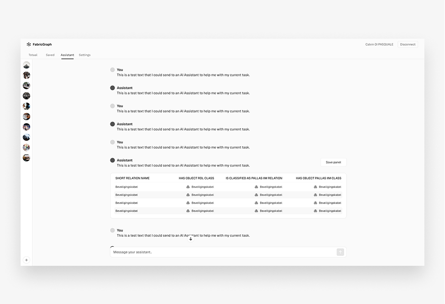
Tooltip support and inline guidance for working with technical content
UI Decisions
Visual Style
Minimal, information-dense layout optimized for focus
Consistent icons and spacing to aid scannability
Components
Class browser (tree structure)
Right-hand editing panel with expandable sections (attributes, restrictions, relationships)
Semantic indicators like class type, parent, and hierarchy status
Research
Researched semantic modeling tools like Protégé, Neo4j Browser, and infrastructure-specific object libraries. Found that most tools lacked visual clarity and onboarding ease. Learned that traceability and restriction visibility are key for power users.
User Flow Overview
User Flow
1. Select class from hierarchy
2. View its attributes, relationships, and metadata
3. Edit or extend connections, restrictions, and inheritance logic
4. Save changes → System auto-updates dependent nodes
Visual Design
Color Palette
Light greys and muted blues to reduce eye strain in long sessions
Typography
Sharp, professional sans-serifs for high legibility
Microinteractions
Hover highlights, save confirmations, inline error indicators
Tools Used
Figma (wireframes, prototypes, UI design)
Notion (research and documentation)
Results
Created a scalable UI for editing and visualizing complex data structures. Reduced user friction in adding or modifying deep hierarchy logic. Provided a framework to support consistent schema development across infrastructure systems.
Lessons Learned
In data-heavy UIs, clarity always beats decoration. Giving users confidence through visibility and validation prevents errors. The best technical tools feel powerful without feeling overwhelming.